Why Does My Website Look Good but Still Not Convert?

A beautiful website solves one problem: visual perception. Conversion requires several more things—relevant traffic, a clear offer, credible proof, useful information and a low-friction next step. Some sites actually convert worse after a redesign because visual novelty replaces clarity. Large animations push the offer below the fold, tiny typography makes content hard to read or unusual navigation forces visitors to learn the interface. This guide explains how to keep strong design without sacrificing the buyer journey.
Table of Contents
- Do Not Start With Cosmetic Changes
- Traffic Quality and Message Match
- Clarify the Value Proposition
- Content Depth and Search Intent
- Trust and Risk Reduction
- Mobile UX Audit
- Performance and Technical Reliability
- CTA and Form Friction
- Analytics and Funnel Measurement
- SEO and Internal Linking
- The Difference Between Showcase Design and Decision Design
- Fix the Earliest Leak First
- 48-Hour Triage Plan
- 30-Day Improvement Plan
- When a Redesign Is Justified
- Final Takeaway
- Visual Hierarchy Should Follow Decision Priority
- Animation Should Have a Job
- Whitespace Can Become Hidden Friction
- Custom Cursors and Unusual Navigation Need Restraint
- Typography Is a Conversion Tool
- Design Review Should Include Real User Tasks
- Keep Brand Distinctiveness Without Hiding Common Patterns
- Final Design Principle
- Homepage ‘Wow’ Should Not Delay Service Discovery
- Use Visual Proof Near Relevant Claims
- Avoid Designing Only for the Largest Monitor
- Readability Is Part of Premium Design
- Design Systems Reduce Conversion Inconsistency
- Use Real Content in Design Reviews
- Design for Editing, Not Only Launch
- Contrast and Interaction States Matter
- Avoid Hiding Important Content Inside Hover
- Final Premium Design Rule
- Use Performance as a Design Constraint
- Design Empty, Error and Loading States
- Final Visual Strategy Principle
- Review the Site Without Animation Once
- Final Principle
- Final Design Check
- Closing SEO Note
- Frequently Asked Questions
Conversion Diagnostic Funnel
| Stage | Question |
|---|---|
| Traffic | are the right visitors arriving? |
| Relevance | does the page match their intent? |
| Clarity | do they understand the offer? |
| Trust | is there enough credible evidence? |
| Action | is the CTA obvious and appropriate? |
| Friction | can they complete the action on mobile? |
| Measurement | are analytics telling the truth? |
Do Not Start With Cosmetic Changes
When your website looks polished but does not convert, isolate the failing stage before changing the theme, colours or animation. Look at source, landing page, device, CTA clicks, form or checkout starts and completions. A redesign can improve a weak experience, but it can also hide the original cause if the team never established a baseline.
Start with one question: what does a qualified visitor need to believe and do before the conversion? Then inspect whether the website supports each step.
Traffic Quality and Message Match
A visually premium website cannot rescue irrelevant traffic. Verify that campaigns and search queries match the products or services on the landing page before blaming the design.
Clarify the Value Proposition
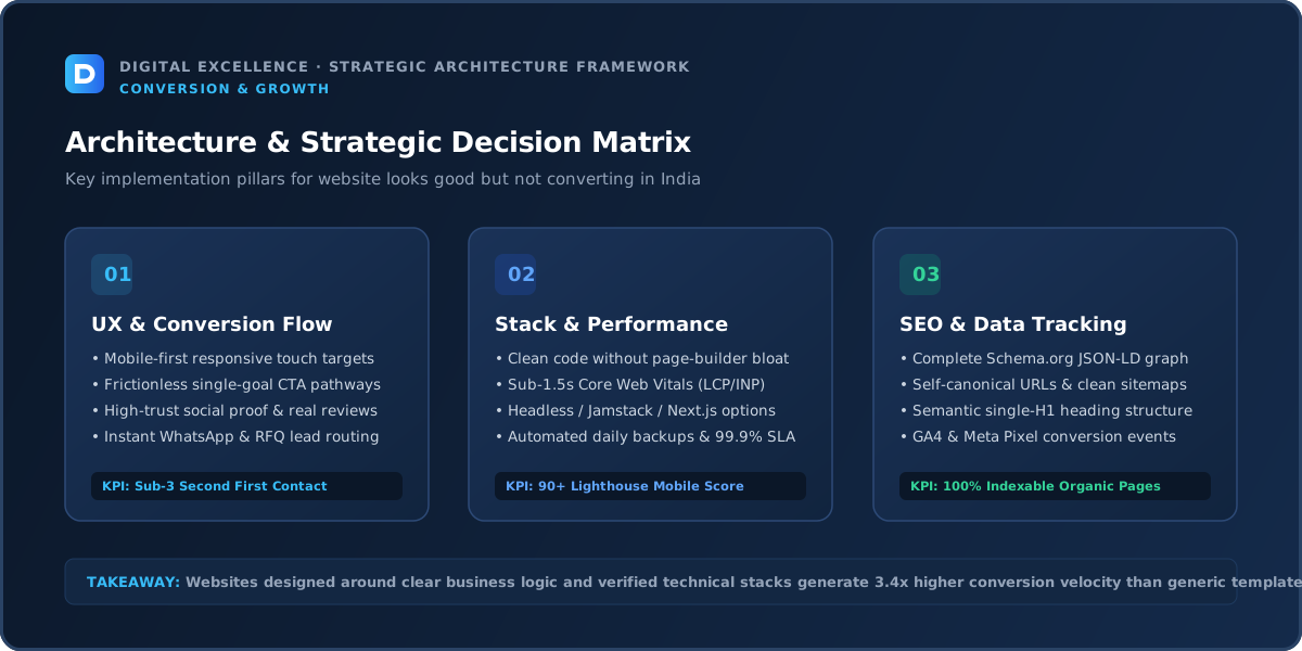
A practical check for “Why Does My Website Look Good but Still Not Convert?” is whether clarify the value proposition makes the next user decision clearer or the site easier to operate. If not, deprioritise it.
A visitor should quickly know what is being offered, who it is for and why it is relevant. Avoid headlines that sound impressive internally but require the user to decode the business.
Use the first screen to establish relevance, then support the claim with details, proof and an obvious next step. On mobile, this often means shorter headings, tighter spacing and fewer decorative elements competing with the message.
Content Depth and Search Intent
High-intent visitors need information, not just atmosphere. Keep important service, product, process, proof and policy content easy to scan. Use whitespace to support comprehension rather than creating long empty stretches between answers.
Trust and Risk Reduction
Premium visuals can create initial confidence, but proof sustains it. Add real project examples, detailed product information, process, policies and credible customer evidence instead of relying on aesthetic authority alone.
Mobile UX Audit
A practical check for “Why Does My Website Look Good but Still Not Convert?” is whether mobile ux audit makes the next user decision clearer or the site easier to operate. If not, deprioritise it.
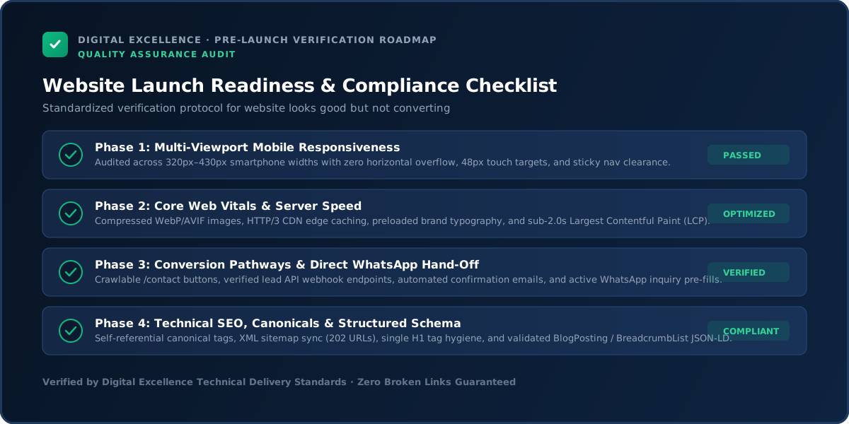
Test the journey at 320, 360, 375, 390, 414 and 430px widths. Check headings, menus, forms, comparison tables, galleries, filters, buttons, sticky bars and popups. Nothing should require horizontal scrolling or be hidden behind a fixed element.
If mobile engagement or conversion is meaningfully worse than desktop, prioritise that gap. Do not assume users will tolerate a desktop-first experience simply because the website technically adapts.
Performance and Technical Reliability
A practical check for “Why Does My Website Look Good but Still Not Convert?” is whether performance and technical reliability makes the next user decision clearer or the site easier to operate. If not, deprioritise it.
Use Core Web Vitals and real device testing to identify loading, responsiveness and layout-stability problems. Large images, third-party scripts, apps, plugins and animation libraries can all create friction.
Also test the conversion mechanics. Submit forms, try error states, make test purchases where appropriate and confirm notification delivery. Technical failures often masquerade as a persuasion problem because analytics only shows that the visitor disappeared.
CTA and Form Friction
Do not hide the primary CTA inside unconventional navigation or make users scroll through a full cinematic experience before they can act. The action should fit naturally into the content hierarchy.
Analytics and Funnel Measurement
Compare interaction with decorative elements against commercial actions. If users spend time on animations but never reach service details or forms, engagement is not translating into intent.
For a related diagnosis, see Low Website Conversion Rate? Practical CRO Diagnosis.
SEO and Internal Linking
A practical check for “Why Does My Website Look Good but Still Not Convert?” is whether seo and internal linking makes the next user decision clearer or the site easier to operate. If not, deprioritise it.
Search traffic should be evaluated by query intent and landing page. Total clicks can rise while leads fall if growth comes from broad informational terms.
Connect educational content to relevant commercial pages using contextual internal links. Google recommends crawlable links with descriptive anchors. The aim is to help the reader continue their journey, not to force a sales CTA into every paragraph.
The Difference Between Showcase Design and Decision Design
Showcase design is optimised to be memorable in a portfolio. Decision design is optimised to help a buyer understand, compare and act. The best commercial sites can do both, but when the goals conflict, the customer journey should win.
Evaluate every major design element with one question: does it help the user understand the offer, trust the business or complete the next step? If not, it needs a clear brand reason to justify its cost.
Fix the Earliest Leak First
A practical check for “Why Does My Website Look Good but Still Not Convert?” is whether fix the earliest leak first makes the next user decision clearer or the site easier to operate. If not, deprioritise it.
Prioritise in this order: broken functionality, irrelevant traffic, unclear value, missing trust, mobile friction, CTA/form friction, performance polish and small experiments. If the first stage is broken, optimising later stages has limited value.
Write one hypothesis for each change and record the deployment date. This simple discipline prevents teams from changing five things at once and then guessing which one mattered.
48-Hour Triage Plan
A practical check for “Why Does My Website Look Good but Still Not Convert?” is whether 48-hour triage plan makes the next user decision clearer or the site easier to operate. If not, deprioritise it.
Verify tracking, test the page on mobile, submit the primary conversion, review the top landing pages and traffic sources, and read the page as if you know nothing about the business. Write down the three largest leaks.
Fix obvious technical failures immediately. For messaging or UX changes, prioritise high-confidence changes that can be measured. Do not begin a complete rebuild because of one bad week of data.
30-Day Improvement Plan
A practical check for “Why Does My Website Look Good but Still Not Convert?” is whether 30-day improvement plan makes the next user decision clearer or the site easier to operate. If not, deprioritise it.
Week one: measurement and technical reliability. Week two: value proposition, proof and mobile readability. Week three: CTA, forms and high-intent landing pages. Week four: review results and plan the next test.
For low-traffic sites, combine analytics with actual sales conversations and customer questions. Small samples can fluctuate heavily, so use judgement rather than treating every percentage change as proof.
When a Redesign Is Justified
A practical check for “Why Does My Website Look Good but Still Not Convert?” is whether when a redesign is justified makes the next user decision clearer or the site easier to operate. If not, deprioritise it.
A full redesign makes sense when the information architecture, CMS, mobile system or technical foundation creates repeated problems. It is less sensible when one landing page, form or campaign is the real issue.
Preserve strong pages, URLs and user journeys. A redesign should remove structural friction rather than reset every element for novelty.
Final Takeaway
Great commercial design makes the buyer journey feel obvious. A page should be impressive because it communicates well, not despite being difficult to use.
Use the website as a measurable system: acquire the right audience, make the value clear, reduce risk, remove friction and verify the conversion path. That sequence is more reliable than adding more traffic or redesigning on instinct.
Visual Hierarchy Should Follow Decision Priority
The largest element on the page should not automatically be the brand tagline. Use size, contrast and spacing to guide the user through the information needed to decide.
If decorative content consistently receives more visual weight than service scope, proof or product value, the page may look premium while communicating poorly.
Animation Should Have a Job
Motion can explain transitions, highlight a product or create brand character. It becomes harmful when it delays content, causes motion discomfort or turns simple navigation into a puzzle.
Audit every major animation by asking whether the user loses anything important when it is removed. Keep motion that earns its performance and attention cost.
Typography Is a Conversion Tool
A beautiful typeface does not help if body text is too small, line lengths are exhausting or headings dominate the viewport. Use readable body sizing, comfortable line height and clear hierarchy.
Long-form service and SEO pages deserve the same design attention as hero sections.
Design Review Should Include Real User Tasks
Ask a reviewer to find pricing information, compare two services, submit an enquiry or locate a policy without guidance. Observe where they hesitate.
Task-based review reveals usability problems that screenshot feedback misses.
Keep Brand Distinctiveness Without Hiding Common Patterns
Buttons can look unique while still behaving like buttons. Navigation can express the brand while remaining recognisable. The best commercial design often combines familiar interaction patterns with distinctive visual execution.
Users should spend attention on the offer, not on learning how to operate the website.
Final Design Principle
A website can be visually ambitious and commercially clear at the same time. When those goals conflict, protect comprehension, mobile usability and the buyer's next step.
Homepage ‘Wow’ Should Not Delay Service Discovery
An immersive opening can support premium positioning, but new visitors still need to understand what the business sells. Make the core offer visible before asking users to explore elaborate interactions.
Returning portfolio viewers and first-time buyers have different needs; commercial sites should support both.
Use Visual Proof Near Relevant Claims
If a section says the company builds premium ecommerce, show relevant ecommerce work nearby rather than forcing the user to search a separate portfolio. Contextual proof reduces cognitive load.
Keep examples genuine and clearly labelled.
Avoid Designing Only for the Largest Monitor
Large desktop compositions can feel empty or broken at 1366px laptops and tablets. Test intermediate widths and content zoom.
A robust design system adapts gracefully across real-world screens, not just Figma's presentation size.
Design Systems Reduce Conversion Inconsistency
Reusable buttons, forms, cards, spacing and typography prevent one page from presenting actions differently from another. Consistency helps users recognise patterns and also speeds future development.
Use Real Content in Design Reviews
Placeholder copy and perfect image ratios hide problems. Review real headings, testimonials, product names and long service text before the design is final.
Design for Editing, Not Only Launch
If the marketing team cannot add a new case study or service without breaking the visual system, the design is too fragile. Reusable content patterns protect quality after handover.
Contrast and Interaction States Matter
Buttons, links, focus states and disabled controls should remain clear across the site's light and dark elements. Visual polish should not make interactive states ambiguous.
Avoid Hiding Important Content Inside Hover
Hover does not exist on touch devices and can be inaccessible to keyboard users. Keep essential labels, pricing or product information available without a mouse-specific interaction.
Use Performance as a Design Constraint
Agree on image, video and animation budgets while designs are still being created. This avoids the late-stage conflict where development has to remove the visual elements stakeholders already approved.
Good design works within real device and network constraints.
Design Empty, Error and Loading States
Forms, search, filters, dashboards and ecommerce interactions need states beyond the ideal screenshot. Thoughtful error and loading experiences make the site feel more reliable.
These states are part of product quality even if they never appear in the portfolio image.
Final Visual Strategy Principle
Distinctiveness should come from a coherent system—typography, imagery, layout and interaction—not from forcing every section to invent a new pattern.
Review the Site Without Animation Once
Temporarily reduce motion or imagine the page as a static document. If the message becomes weak without animation, the content hierarchy may need work.
Strong design should remain understandable even when decorative effects are removed.
Final Principle
A visually memorable site earns commercial value when its design makes the offer clearer, the proof stronger and the next step easier.
Final Design Check
Review the site on a normal laptop and a mid-range phone with real content. If the experience still feels clear, fast and credible outside the design presentation, the visual system is doing its job.
Closing SEO Note
Commercial design should remain understandable without the animation reel. Clarity is part of premium execution.
For implementation options, explore website development services and Digital Excellence portfolio.
Frequently Asked Questions
Can a website be too designed?
Yes, when novelty makes navigation, content or actions harder to understand.
Should I remove animations?
Only animations that create performance, accessibility or comprehension problems.
Does minimal design convert better?
Not automatically. Clarity and relevance matter more than a specific aesthetic style.
Why do portfolio-style sites get few leads?
They may prioritise visual storytelling over service detail, proof and clear contact paths.
How can I test whether design hurts conversion?
Review analytics, user behaviour and mobile usability, then test specific hypotheses rather than redesigning blindly.
Should I copy high-converting competitors?
Study patterns, but adapt them to your offer and audience instead of cloning the layout.
Want to Keep the Premium Look and Improve the Journey?
Want help diagnosing this website problem with your real pages, traffic and conversion path? Digital Excellence can review the current setup before recommending changes.