Why Is My Website Losing Customers on Mobile?

Mobile traffic is often the first experience customers have with a business, yet many websites are still designed on a large monitor and merely compressed for phones. The result can technically be “responsive” while creating oversized headings, hidden controls, slow images and forms that are frustrating to complete. If mobile performance is much weaker than desktop, treat it as a separate product problem. This guide shows what to inspect before assuming mobile users simply have lower intent.
Table of Contents
- Do Not Start With Cosmetic Changes
- Traffic Quality and Message Match
- Clarify the Value Proposition
- Content Depth and Search Intent
- Trust and Risk Reduction
- Mobile UX Audit
- Performance and Technical Reliability
- CTA and Form Friction
- Analytics and Funnel Measurement
- SEO and Internal Linking
- Test More Than One Mobile Width
- Fix the Earliest Leak First
- 48-Hour Triage Plan
- 30-Day Improvement Plan
- When a Redesign Is Justified
- Final Takeaway
- Compare Mobile and Desktop for the Same Channel
- Keyboard Behaviour Can Break Forms
- Sticky Elements Need a Layering Audit
- Tables Need a Mobile Strategy
- Large Media Should Respond to Screen Size
- Test Thumb Reach and Tap Targets
- Respect Mobile Context
- Final Mobile Rule
- Mobile Navigation Should Expose the Most Important Destinations Quickly
- Mobile Forms Need Error Messages Near the Field
- Carousels Need Touch and Accessibility QA
- Mobile Tables and Comparison Content Should Preserve Meaning
- Test With Browser UI and Safe Areas
- Test Mobile at 200% Text Zoom Where Practical
- Mobile Modals Need Escape Routes
- Reduce Auto-Playing Media on Mobile
- Check Orientation and Tablet Breakpoints
- Final Mobile QA Rule
- Test Mobile Under Slow Network Conditions
- Check Fixed Bottom Navigation Against Forms and Keyboard
- Use Mobile Content Priority Rather Than Content Deletion
- Final Mobile Strategy Principle
- Use Real Content Lengths in Every Reusable Component
- Final Principle
- Final Mobile Check
- Closing SEO Note
- Frequently Asked Questions
Conversion Diagnostic Funnel
| Stage | Question |
|---|---|
| Traffic | are the right visitors arriving? |
| Relevance | does the page match their intent? |
| Clarity | do they understand the offer? |
| Trust | is there enough credible evidence? |
| Action | is the CTA obvious and appropriate? |
| Friction | can they complete the action on mobile? |
| Measurement | are analytics telling the truth? |
Do Not Start With Cosmetic Changes
When mobile visitors leave or convert much worse than desktop visitors, isolate the failing stage before changing the theme, colours or animation. Look at source, landing page, device, CTA clicks, form or checkout starts and completions. A redesign can improve a weak experience, but it can also hide the original cause if the team never established a baseline.
Start with one question: what does a qualified visitor need to believe and do before the conversion? Then inspect whether the website supports each step.
Traffic Quality and Message Match
Mobile and desktop traffic can come from different channels. Social campaigns may be mostly mobile while branded or workplace searches may skew desktop. Compare the same source when diagnosing a device gap.
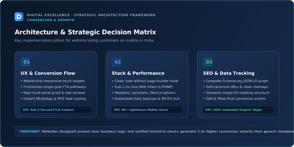
Clarify the Value Proposition
For “Why Is My Website Losing Customers on Mobile?”, interpret clarify the value proposition through the specific business goal and audience of the page so the recommendation stays practical rather than becoming a generic checklist.
A visitor should quickly know what is being offered, who it is for and why it is relevant. Avoid headlines that sound impressive internally but require the user to decode the business.
Use the first screen to establish relevance, then support the claim with details, proof and an obvious next step. On mobile, this often means shorter headings, tighter spacing and fewer decorative elements competing with the message.
Content Depth and Search Intent
Mobile content needs prioritisation. Put the core message, proof and action earlier, but do not remove information buyers still need. Use collapsible sections for secondary detail when it improves scanning without hiding essential answers.
Trust and Risk Reduction
Small screens amplify sloppiness. Cropped logos, blurry images, broken spacing, intrusive popups and overlapping WhatsApp buttons can make the business feel less credible. Ensure policies and contact information are easy to reach.
Mobile UX Audit
For “Why Is My Website Losing Customers on Mobile?”, interpret mobile ux audit through the specific business goal and audience of the page so the recommendation stays practical rather than becoming a generic checklist.
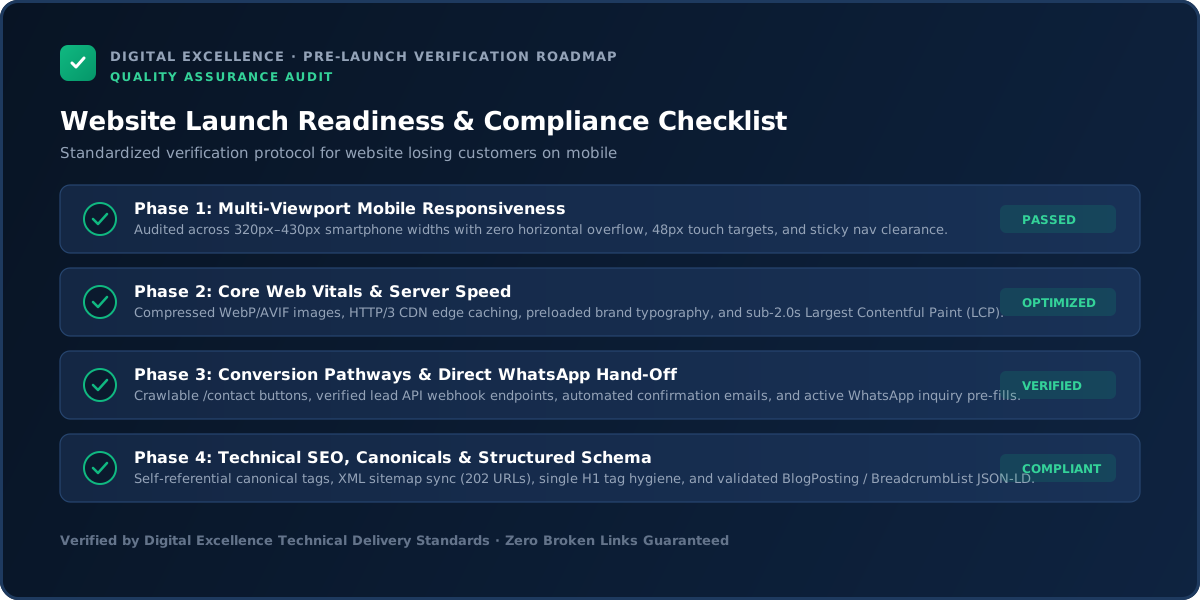
Test the journey at 320, 360, 375, 390, 414 and 430px widths. Check headings, menus, forms, comparison tables, galleries, filters, buttons, sticky bars and popups. Nothing should require horizontal scrolling or be hidden behind a fixed element.
If mobile engagement or conversion is meaningfully worse than desktop, prioritise that gap. Do not assume users will tolerate a desktop-first experience simply because the website technically adapts.
Performance and Technical Reliability
For “Why Is My Website Losing Customers on Mobile?”, interpret performance and technical reliability through the specific business goal and audience of the page so the recommendation stays practical rather than becoming a generic checklist.
Use Core Web Vitals and real device testing to identify loading, responsiveness and layout-stability problems. Large images, third-party scripts, apps, plugins and animation libraries can all create friction.
Also test the conversion mechanics. Submit forms, try error states, make test purchases where appropriate and confirm notification delivery. Technical failures often masquerade as a persuasion problem because analytics only shows that the visitor disappeared.
CTA and Form Friction
Buttons should be easy to tap and not compete with browser UI or other floating elements. Forms need correct input types, sensible field order and enough space for validation messages.
Analytics and Funnel Measurement
Compare mobile page performance, CTA clicks, form completion, ecommerce funnel stages and error rates. Test analytics events on real devices after major changes.
For a related buying decision, see Why Is My Website So Slow on Mobile? Diagnose the Real Bottleneck.
SEO and Internal Linking
For “Why Is My Website Losing Customers on Mobile?”, interpret seo and internal linking through the specific business goal and audience of the page so the recommendation stays practical rather than becoming a generic checklist.
Search traffic should be evaluated by query intent and landing page. Total clicks can rise while leads fall if growth comes from broad informational terms.
Connect educational content to relevant commercial pages using contextual internal links. Google recommends crawlable links with descriptive anchors. The aim is to help the reader continue their journey, not to force a sales CTA into every paragraph.
Test More Than One Mobile Width
A layout that works at 390px can fail at 320px or 430px because heading wraps, sticky elements and carousels behave differently. Test common widths plus real iOS and Android devices when possible.
Also test landscape and keyboard-open states for important forms. Mobile QA should follow the complete user journey, not only the homepage screenshot.
Fix the Earliest Leak First
For “Why Is My Website Losing Customers on Mobile?”, interpret fix the earliest leak first through the specific business goal and audience of the page so the recommendation stays practical rather than becoming a generic checklist.
Prioritise in this order: broken functionality, irrelevant traffic, unclear value, missing trust, mobile friction, CTA/form friction, performance polish and small experiments. If the first stage is broken, optimising later stages has limited value.
Write one hypothesis for each change and record the deployment date. This simple discipline prevents teams from changing five things at once and then guessing which one mattered.
48-Hour Triage Plan
For “Why Is My Website Losing Customers on Mobile?”, interpret 48-hour triage plan through the specific business goal and audience of the page so the recommendation stays practical rather than becoming a generic checklist.
Verify tracking, test the page on mobile, submit the primary conversion, review the top landing pages and traffic sources, and read the page as if you know nothing about the business. Write down the three largest leaks.
Fix obvious technical failures immediately. For messaging or UX changes, prioritise high-confidence changes that can be measured. Do not begin a complete rebuild because of one bad week of data.
30-Day Improvement Plan
For “Why Is My Website Losing Customers on Mobile?”, interpret 30-day improvement plan through the specific business goal and audience of the page so the recommendation stays practical rather than becoming a generic checklist.
Week one: measurement and technical reliability. Week two: value proposition, proof and mobile readability. Week three: CTA, forms and high-intent landing pages. Week four: review results and plan the next test.
For low-traffic sites, combine analytics with actual sales conversations and customer questions. Small samples can fluctuate heavily, so use judgement rather than treating every percentage change as proof.
When a Redesign Is Justified
For “Why Is My Website Losing Customers on Mobile?”, interpret when a redesign is justified through the specific business goal and audience of the page so the recommendation stays practical rather than becoming a generic checklist.
A full redesign makes sense when the information architecture, CMS, mobile system or technical foundation creates repeated problems. It is less sensible when one landing page, form or campaign is the real issue.
Preserve strong pages, URLs and user journeys. A redesign should remove structural friction rather than reset every element for novelty.
Final Takeaway
Mobile users are not failed desktop users. Design the journey for the device they actually have in their hand.
Use the website as a measurable system: acquire the right audience, make the value clear, reduce risk, remove friction and verify the conversion path. That sequence is more reliable than adding more traffic or redesigning on instinct.
Compare Mobile and Desktop for the Same Channel
A mobile conversion gap can be exaggerated when mobile traffic comes mostly from social ads while desktop traffic comes from branded search. Segment by source before blaming the interface.
Then compare equivalent high-intent traffic to see whether mobile usability is genuinely underperforming.
Keyboard Behaviour Can Break Forms
On mobile, the virtual keyboard changes viewport height and can cover fields, validation or fixed CTAs. Test contact, checkout and booking forms while the keyboard is open.
Use appropriate input types for phone, email, numbers and dates so the device can present the right keyboard.
Sticky Elements Need a Layering Audit
Headers, cookie notices, WhatsApp, chat, bottom navigation and sticky CTAs can overlap until only half the screen remains for content. List every fixed element and decide which ones are essential on each page type.
A single clear sticky action is usually easier to manage than several competing controls.
For a useful scope comparison, read Visitors Leaving Your Website Fast? What to Fix.
Tables Need a Mobile Strategy
Pricing, specifications and comparisons often break on narrow screens. Options include horizontal scrolling with clear affordance, stacked cards or simplified priority columns.
Do not shrink table text until it becomes unreadable merely to avoid overflow.
Large Media Should Respond to Screen Size
Do not send a desktop-sized hero image to every phone if responsive images can deliver a smaller asset. Videos should have a clear reason to autoplay and should not block meaningful content.
Performance and visual quality can coexist when media is prepared correctly.
Test Thumb Reach and Tap Targets
Important buttons and controls should be easy to tap without accidental activation of neighbouring elements. Small icon-only controls can be especially difficult in filters, galleries and forms.
Mobile QA should include interaction, not only visual screenshots.
Respect Mobile Context
A visitor on mobile may be moving, using limited bandwidth or trying to complete a quick task. Prioritise phone, directions, booking, product selection or enquiry depending on the business.
Desktop can support more expansive storytelling; mobile should remain focused.
Final Mobile Rule
Design the mobile journey as a first-class product. If the most important customer action is awkward on a phone, the website is not truly responsive no matter how neatly the columns stack.
Mobile Forms Need Error Messages Near the Field
Users should not submit a long form and then be sent to the top with no explanation. Show validation close to the relevant field and preserve entered data after an error.
This is especially important when the keyboard changes the visible area.
Carousels Need Touch and Accessibility QA
Make swipe behaviour predictable and provide controls that are large enough to tap. Avoid auto-advancing content so quickly that users cannot read it.
For testimonials or portfolio media, a static stack can sometimes be more usable than a carousel on small screens.
Mobile Tables and Comparison Content Should Preserve Meaning
When converting a table to cards, keep labels with every value so context is not lost. If horizontal scrolling is used, make it visually obvious.
Do not hide important comparison columns merely to make the layout fit.
Test With Browser UI and Safe Areas
Mobile browser bars, notches and home indicators can affect fixed controls near screen edges. Use appropriate spacing and test iOS/Android behaviour rather than relying only on desktop emulation.
For the next planning step, use Website Forms Getting No Submissions? Check These 12 Problems.
Test Mobile at 200% Text Zoom Where Practical
Users may increase text size for readability. Check that navigation, buttons and forms do not break when content grows.
Flexible layouts handle larger text better than fixed-height components.
Mobile Modals Need Escape Routes
If a modal or menu opens, the close control should remain reachable and keyboard/back-button behaviour should be predictable. Avoid trapping the user inside full-screen overlays.
Reduce Auto-Playing Media on Mobile
Autoplay video can consume bandwidth, delay content and distract from the primary action. Use it only when it adds clear value and provide appropriate controls.
Check Orientation and Tablet Breakpoints
Some layouts fail between mobile and desktop sizes. Test tablets and landscape phones, especially for navigation, tables and multi-column forms.
Final Mobile QA Rule
A mobile build is ready only after the complete business journey has been tested on actual small screens, not after the browser preview looks approximately correct.
Test Mobile Under Slow Network Conditions
A page that feels smooth on office Wi-Fi may behave differently on a busy mobile connection. Use throttled tests and real devices to identify heavy media or scripts that delay interaction.
Use Mobile Content Priority Rather Than Content Deletion
Reorder essential information earlier and collapse secondary detail when helpful, but avoid removing decision-critical content simply to make the page shorter.
Final Mobile Strategy Principle
Mobile design is prioritisation under constraint. Give the smallest screen the clearest path to the user's main task, then add richness without blocking it.
Use Real Content Lengths in Every Reusable Component
Cards, buttons and navigation labels should handle long names and translated content where relevant. Fixed heights and truncated text often fail first on mobile.
Final Principle
Mobile quality is the combined result of layout, performance and interaction. Test all three together on the pages that matter most to the business.
Final Mobile Check
Complete the highest-value journey using only one thumb on a small phone: open navigation, find the offer, read the important detail and submit or buy. Every obstacle in that sequence deserves priority over cosmetic polish.
Closing SEO Note
Mobile-first means testing the complete real journey, including keyboard, sticky UI, errors and slow connections—not only checking responsive screenshots.
For implementation options, explore website development services and Digital Excellence portfolio.
Frequently Asked Questions
Why is mobile conversion lower than desktop?
Traffic mix can differ, but mobile speed, navigation, forms and screen constraints can also create additional friction.
What font size should mobile body text use?
There is no universal size, but 16px+ is a common readability baseline; Digital Excellence's editorial system targets around 17–18px.
Should I hide content on mobile?
Only when it is genuinely secondary. Do not remove information users need to make a decision.
Are sticky CTAs good on mobile?
They can be useful if they do not cover content or compete with other fixed elements.
How do I test mobile performance?
Use real devices plus lab tools and Core Web Vitals data where available.
Should mobile design be created separately?
Responsive systems should share components, but important mobile states deserve deliberate design decisions.
Need a Mobile-First Website Audit?
Need a website scope or quote based on your real requirements rather than a generic package? Digital Excellence can review the pages, platform, integrations, SEO needs and launch priorities.