Why Are Customers Leaving My Product Pages Without Buying?

When shoppers reach a product page but do not add to cart, you have already solved part of the funnel: they found a product worth inspecting. The next question is why the product page does not give them enough confidence or motivation to continue. The answer may be the offer itself, not the layout. This guide separates product-market issues from product-page UX so ecommerce teams know what to fix first.
Table of Contents
- Product Page Conversion Starts With Product-Market Fit
- Make Product Media Answer Real Questions
- Variant and Size Friction
- Mobile Experience
- Technical Reliability and Core Web Vitals
- Search Intent and Content Match
- Trust and Proof
- CTA and Journey Friction
- Analytics and Measurement
- SEO and Internal Links
- Price and Delivery Are Part of the Product Page Experience
- Fix Order
- 48-Hour Triage
- 30-Day Improvement Plan
- When a Redesign Is the Right Answer
- Final Takeaway
- Product Pages Need to Answer Category-Specific Questions
- Price Context Can Reduce Uncertainty
- Product Reviews Need Context
- Stock and Variant Availability Affect Product-Page Conversion
- Delivery Information Should Appear Before Checkout
- Returns and Warranty Reduce Perceived Risk
- Use Questions From Support to Improve the Template
- Measure Product-Page Funnel by SKU or Category
- Mobile Product Media Needs Restraint
- Final Product-Page Rule
- Compare Product Page Performance by Traffic Source
- Use Comparison Content for Complex Products
- Product FAQs Should Be Specific
- Bundles Need Transparent Value
- High-Ticket Products May Need an Assisted Conversion Path
- Use Back-in-Stock and Wishlist Features Only When They Solve a Real Problem
- Product Page SEO Should Support the Buying Decision
- Use Size, Compatibility or Specification Tools Where They Reduce Real Risk
- Show Product Availability Honestly
- Product Videos Should Demonstrate, Not Merely Decorate
- Cross-Sells Should Not Distract From the Primary Decision
- Final Product UX Rule
- Use Product Content Governance
- Review Product Pages After Returns and Complaints
- Prioritise High-Traffic, Low-Add-to-Cart Products
- Final Product Conversion Principle
- Product Page Templates Need a Content Minimum
- Final Principle
- Final Product Page Check
- Closing SEO Note
- Frequently Asked Questions
Diagnostic Checklist
| Product-page question | What the shopper needs |
|---|---|
| What is it? | clear title and core benefit |
| Does it fit me? | variants, size/specs, use cases |
| Can I trust it? | real media, reviews, policies |
| What will it cost? | transparent price/fees |
| When will it arrive? | delivery clarity |
| Can I return it? | accessible policy |
| What next? | clear variant + add-to-cart |
Product Page Conversion Starts With Product-Market Fit
A website cannot persuade every visitor to buy a product they do not want at the offered price. Before changing the layout, compare performance across products and traffic sources. If one product converts and another does not under similar conditions, the problem may be specific to the product or offer.
Use customer questions, returns and support conversations as evidence.
Make Product Media Answer Real Questions
Use images or video to show scale, texture, fit, usage or detail relevant to the category. Decorative lifestyle imagery is useful, but it should not replace the information needed to evaluate the product.
Optimise media so the page remains fast on mobile. Large galleries can create significant performance cost.
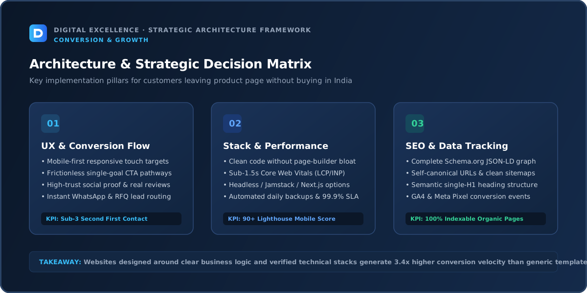
Variant and Size Friction
Colour, size, material and other variants should be easy to understand and select. Make unavailable states clear and avoid resetting selections unexpectedly.
For apparel or fit-sensitive products, provide useful size guidance close to the selector rather than hiding it in a distant footer link.
Mobile Experience
A practical way to use mobile experience here is to ask whether it changes qualified conversion for “customers leaving product page without buying”. If the answer cannot be measured or observed, keep it behind higher-confidence fixes.
Review the issue on real mobile widths and devices, not only a desktop emulator. Check content hierarchy, typography, navigation, forms, buttons, media and any sticky or popup elements. Mobile problems can amplify small weaknesses because screen space and network conditions are constrained.
Compare mobile and desktop by the same traffic source when possible. A device gap can be caused by UX, but it can also be caused by different acquisition channels.
Technical Reliability and Core Web Vitals
A practical way to use technical reliability and core web vitals here is to ask whether it changes qualified conversion for “customers leaving product page without buying”. If the answer cannot be measured or observed, keep it behind higher-confidence fixes.
Google's Core Web Vitals measure loading performance, interaction responsiveness and visual stability. Use them as diagnostic signals alongside real-user behaviour. Large images, scripts, plugins, apps, fonts and unstable components are common sources of friction.
Also test the actual business action. A fast site with a broken form, product selector or checkout still fails the user.
Search Intent and Content Match
Product pages should target the specific item, while collection/category pages support broader shopping intent. Avoid stuffing product descriptions with generic category keywords at the expense of clarity.
Trust and Proof
Use genuine reviews, accurate specifications, return policy, shipping information, secure payment and clear business identity. Avoid fake scarcity or inflated review counts.
CTA and Journey Friction
The add-to-cart button should reflect variant availability and remain easy to reach without covering content. On mobile, test sticky add-to-cart patterns carefully around browser UI and product options.
Analytics and Measurement
Compare product views to add-to-cart and then checkout. Segment by product, device and source. A store-wide average can hide a small group of products responsible for most friction.
SEO and Internal Links
A practical way to use seo and internal links here is to ask whether it changes qualified conversion for “customers leaving product page without buying”. If the answer cannot be measured or observed, keep it behind higher-confidence fixes.
Review which queries and pages generate the traffic. Total sessions are not enough. A page can rank for broad informational terms that never had strong commercial intent.
Use contextual internal links to connect useful guides with relevant service, category or product pages. Google recommends crawlable links with meaningful anchor text. Do not create repetitive doorway pages simply to capture every variation of a phrase.
For a related buying decision, see Ecommerce Traffic but No Sales? Diagnose the Funnel.
Price and Delivery Are Part of the Product Page Experience
If shipping costs or delivery times appear only at checkout, shoppers may hesitate earlier because they cannot estimate the total offer. Show useful delivery and return guidance without overwhelming the page.
If price is the objection, rearranging the button will not solve it. Test offer, bundles, value explanation or merchandising rather than hiding the price issue.
Fix Order
A practical way to use fix order here is to ask whether it changes qualified conversion for “customers leaving product page without buying”. If the answer cannot be measured or observed, keep it behind higher-confidence fixes.
Fix broken functionality first, then traffic mismatch, unclear message, missing proof, mobile friction, conversion friction and performance polish. This prevents teams from running small experiments on top of a structural problem.
Document changes and deployment dates so you can compare before and after without relying on memory.
48-Hour Triage
A practical way to use 48-hour triage here is to ask whether it changes qualified conversion for “customers leaving product page without buying”. If the answer cannot be measured or observed, keep it behind higher-confidence fixes.
Verify analytics, reproduce the issue on mobile, test the main conversion path and review the top traffic sources and landing pages. Identify three high-confidence problems rather than making a list of 30 cosmetic ideas.
Implement obvious reliability fixes immediately. For behavioural changes, write a hypothesis and decide which metric should move if the fix works.
30-Day Improvement Plan
A practical way to use 30-day improvement plan here is to ask whether it changes qualified conversion for “customers leaving product page without buying”. If the answer cannot be measured or observed, keep it behind higher-confidence fixes.
Week one: measurement and technical errors. Week two: message, content and proof. Week three: mobile and conversion path. Week four: review results and plan the next iteration.
Low-traffic sites need more qualitative evidence—sales calls, customer questions, support messages—because small analytics samples are noisy.
When a Redesign Is the Right Answer
A practical way to use when a redesign is the right answer here is to ask whether it changes qualified conversion for “customers leaving product page without buying”. If the answer cannot be measured or observed, keep it behind higher-confidence fixes.
Redesign when the information architecture, design system, CMS or technical foundation causes repeated problems that cannot be fixed cleanly. If the issue is one page, one form or one campaign, targeted improvements are usually faster and safer.
Preserve valuable URLs and content during any redesign. A visual refresh should not accidentally destroy search or operational assets.
Final Takeaway
A product page should make the product easier to evaluate. If visitors still reject a clear, trustworthy offer, investigate product, price and traffic before redesigning the page.
Product Pages Need to Answer Category-Specific Questions
A clothing shopper needs fit and size; a furniture buyer needs dimensions and delivery; a cosmetic buyer needs shade or ingredients. Generic product templates often fail because they treat every category the same.
Build reusable sections around the questions customers actually ask before buying.
Price Context Can Reduce Uncertainty
For some products, bundles, per-unit value, financing or comparison information helps shoppers understand price. Do not hide fees or essential shipping information until checkout.
If the price is materially higher than alternatives, explain genuine differentiators instead of relying on visual luxury alone.
Product Reviews Need Context
Reviews are most useful when they address real questions such as fit, durability, scent, delivery or use case. Genuine customer photos can help in visual categories.
Do not fabricate reviews or manipulate ratings. Trust lost here affects the entire store.
Stock and Variant Availability Affect Product-Page Conversion
If popular sizes or colours are unavailable, low add-to-cart may not be a UX problem. Segment performance by availability and review how sold-out variants are presented.
Consider waitlist or back-in-stock options when operations can support them.
Delivery Information Should Appear Before Checkout
Users may hesitate to add to cart when they cannot estimate delivery time or shipping cost. Provide useful guidance on the product page or cart without making promises the logistics system cannot keep.
For a useful scope comparison, read Cart Abandonment: Why Shoppers Don’t Checkout.
Returns and Warranty Reduce Perceived Risk
High-consideration products benefit from accessible return, exchange or warranty information. Summarise the key rule near the decision and link to the full policy.
Avoid vague language that forces customers to search the footer for basic risk information.
Use Questions From Support to Improve the Template
Tag recurring pre-purchase questions and add the answers to relevant product sections. If many users ask the same thing, the page should probably explain it proactively.
Measure Product-Page Funnel by SKU or Category
Compare product views, variant interactions, add-to-cart and purchase by product. Store-wide averages can hide a few weak high-traffic SKUs.
Use this data to prioritise merchandising and content work.
Mobile Product Media Needs Restraint
High-resolution media is important, but loading 15 large images before the buy button can hurt mobile performance. Use responsive formats and prioritise the most informative images first.
Final Product-Page Rule
A product page should make the purchase easier to evaluate. If customers still reject a clear, trustworthy and technically reliable offer, investigate product, price and traffic rather than endlessly redesigning the button.
Compare Product Page Performance by Traffic Source
A product page reached from a branded search may convert differently from the same page reached through cold social ads. Segment before assuming the page itself explains the result.
Message match between ad creative and product page can materially affect behaviour.
Use Comparison Content for Complex Products
When products differ in technical specifications, size, material or use case, a comparison table or selector can reduce uncertainty. Keep the comparison factual and focused on meaningful differences.
Do not overwhelm simple products with unnecessary technical detail.
Product FAQs Should Be Specific
Answer questions about fit, compatibility, use, care, delivery, warranty or ingredients depending on the category. Generic FAQs such as ‘Is this good quality?’ add little value.
Use support and review data to decide which questions deserve a place on the template.
Bundles Need Transparent Value
If bundles are offered, show exactly what is included and how pricing compares with buying items separately. Hidden conditions can make an upsell feel manipulative.
Ensure bundle apps do not create conflicting cart states on mobile.
High-Ticket Products May Need an Assisted Conversion Path
Furniture, jewellery, B2B equipment or customised products may convert through consultation, WhatsApp or a quote rather than direct checkout. Offer that path when operations can support it and track it separately.
Do not judge the product page only by online purchase rate if assisted sales are normal.
Use Back-in-Stock and Wishlist Features Only When They Solve a Real Problem
These features can capture intent when inventory is limited, but they add tools and notifications to maintain. Implement them when stockouts or long consideration cycles justify the complexity.
Measure whether users actually use them.
For the next planning step, use Website Not Building Trust? 15 Signals Customers Look For.
Product Page SEO Should Support the Buying Decision
Unique product content, descriptive titles, structured product information and internal links can help search visibility. Do not fill the page with keyword paragraphs that push essential buying information away from the product.
Search and conversion content should reinforce one another.
Use Size, Compatibility or Specification Tools Where They Reduce Real Risk
Interactive selectors can be valuable for products with complex fit or compatibility. Keep them simple, fast and backed by accurate data.
A tool that gives unreliable recommendations creates more risk than a clear static guide.
Show Product Availability Honestly
If an item is made to order, backordered or available only in some regions, state that before the user reaches payment. Clear availability sets expectations and reduces support.
Product Videos Should Demonstrate, Not Merely Decorate
Use video to show movement, scale, texture, installation or usage when those questions matter. Keep it optional and optimised for mobile.
Cross-Sells Should Not Distract From the Primary Decision
Related products are useful after the shopper understands the current item. Avoid overwhelming the main page with carousels before core information and add-to-cart.
Final Product UX Rule
Prioritise the information that reduces category-specific purchase risk, then make the action simple. Product-page design should follow the buying decision, not a generic ecommerce template.
Use Product Content Governance
Assign ownership for specifications, images, prices, policies and stock-related messaging. Product pages lose trust when information becomes inconsistent across variants or channels.
Review Product Pages After Returns and Complaints
Returns can reveal that photos, dimensions, sizing or expectations were unclear. Feed those reasons back into product content instead of treating them solely as logistics data.
Prioritise High-Traffic, Low-Add-to-Cart Products
Create a simple matrix of traffic and add-to-cart. High-traffic products with weak cart behaviour deserve content, pricing or UX investigation before low-traffic products.
Final Product Conversion Principle
The best product page reduces uncertainty without overwhelming the shopper. Give them the right media, facts, commercial terms and action in the order they need them.
Product Page Templates Need a Content Minimum
Define the required fields every product must have—such as dimensions, material, size, ingredients or compatibility depending on category. This prevents weak SKUs from being published with only a title and image.
Final Principle
A product page succeeds when the shopper can decide confidently whether the item is right for them and complete the next step without avoidable uncertainty.
Final Product Page Check
Ask someone unfamiliar with the product to decide whether it is right for them using only the page. Note every question they still need to ask support. Those unanswered questions become the next content improvements.
Closing SEO Note
Use real customer questions, return reasons and support tickets to keep product-page content accurate as the catalogue evolves.
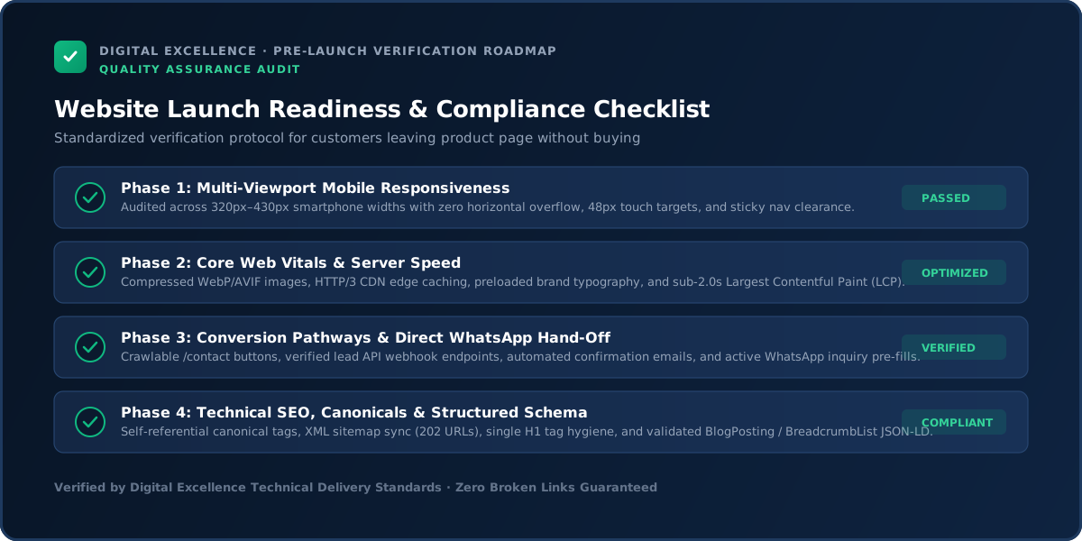
For implementation options, explore website development services and Digital Excellence portfolio.
Frequently Asked Questions
Why do shoppers view products but not add to cart?
Common causes include weak value, insufficient information, price, trust, variants, shipping uncertainty and mobile friction.
Should I use sticky add-to-cart?
It can help when implemented carefully, but must not cover content or bypass required variant selection.
How many product images do I need?
Enough to answer category-specific questions; there is no universal number.
Do reviews help?
Genuine reviews can reduce uncertainty, especially when they address fit, quality or usage.
Should shipping be shown on product pages?
Useful delivery guidance can reduce uncertainty, even if exact shipping is calculated later.
Can SEO product descriptions improve sales?
Useful unique descriptions can help search visibility and buying decisions; keyword stuffing will not.
Need Better Ecommerce Product Pages?
Need a website scope or quote based on your real requirements rather than a generic package? Digital Excellence can review the pages, platform, integrations, SEO needs and launch priorities.